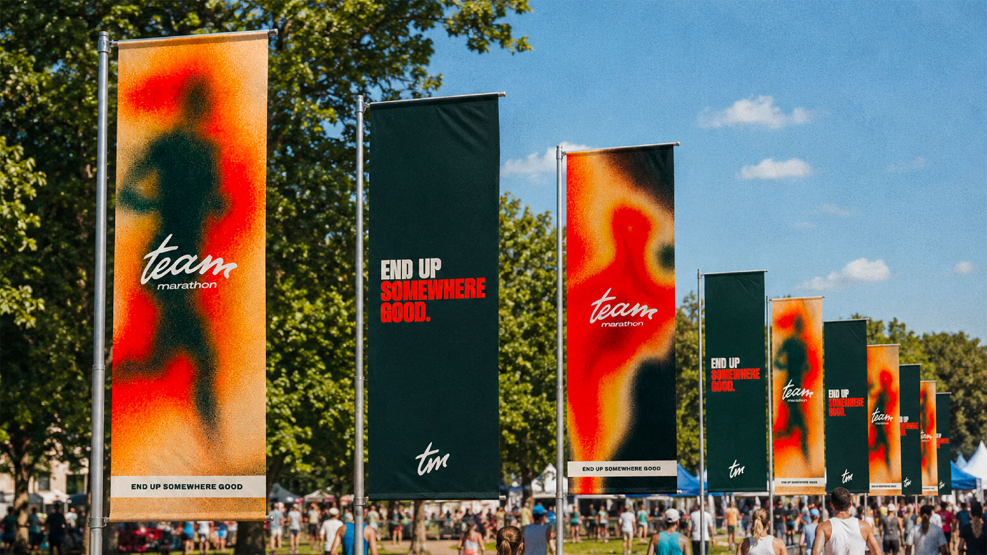
Event branding has to work at two very different speeds. Before the event, it needs to stop a scroll, explain the idea and build enough excitement for someone to act. On the day, it needs to guide thousands of quick decisions without asking for much attention at all.
The best event identities connect those two experiences. The campaign that persuaded someone to enter becomes the visual language that welcomes them, moves them through the space and frames the memories they take away.
Create recognition before adding variety
Events produce a huge number of assets: launch graphics, paid adverts, route maps, emails, bibs, medals, merchandise, gantries and signs. Variety is inevitable, but recognition should come first.
A small number of distinctive ingredients can do a lot of work. A clear type hierarchy, a recognisable colour relationship and one strong compositional device will often be more useful than a large collection of decorative elements.
Those ingredients need to stay legible at every scale. What feels energetic on a social post must still make sense on a directional sign viewed at speed and from a distance.
Hackney Moves shows how a broad festival identity can connect high-energy campaign work with the physical event environment. Run the Wharf uses a distinctive event idea across promotional and participant touchpoints, retaining its character as the format and purpose change.
Treat wayfinding as part of the brand
Wayfinding is not a final layer of arrows applied after the creative work is complete. It is one of the most important ways an event communicates.
Participants need to understand where to go, what happens next and which information applies to them. Clear hierarchy matters more than visual novelty here. Distance, viewing angle, lighting, crowd flow and production materials all influence the design.
When navigation uses the same visual logic as the campaign, the environment feels coherent without becoming over-designed.
Design around the participant journey
Mapping the experience from registration to finish line helps identify where design can reduce uncertainty or increase excitement. Confirmation emails, arrival points, start areas and recovery spaces are all part of the same brand experience.
This approach also exposes gaps early. A beautiful finish gantry cannot compensate for confusing pre-event information, just as a clear route map cannot create atmosphere by itself. Both need to work together. For a more detailed method, read how to create a consistent event participant journey.
Build for production realities
Physical design comes with constraints: print sizes, substrates, fixing methods, weather, lead times and supplier specifications. Bringing these into the process early protects the idea and avoids expensive compromises later.
A scalable identity needs practical artwork rules and repeatable templates for the assets most likely to change. That gives event teams flexibility while keeping late-stage additions visually consistent.
Think beyond the finish line
An event continues through photography, video, results, social content and the next campaign cycle. Distinctive environments create better backdrops for participant content, while a coherent digital toolkit helps the organiser maintain momentum afterwards.
When every stage feels connected, the brand does more than decorate the event. It creates confidence, improves the experience and gives people something worth remembering.
Planning a new event or refreshing an established one? See how we approach brand experiences.