
Illustration is often treated as an extra: something added to a brand or campaign once the main identity and layout are already decided. But it can do much more than fill a space or make a post feel more colourful.
Used with intent, illustration gives a brand a distinctive visual voice. It can capture the character of a place, explain an idea, make a campaign feel more human and create assets that photography or type alone cannot provide.
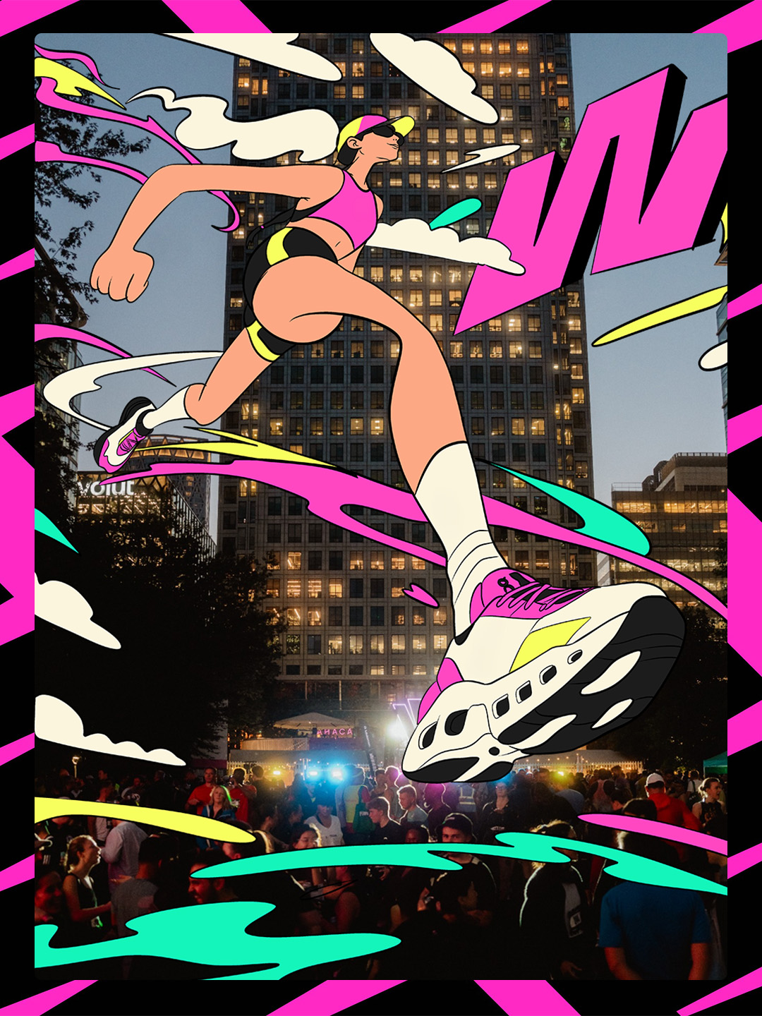
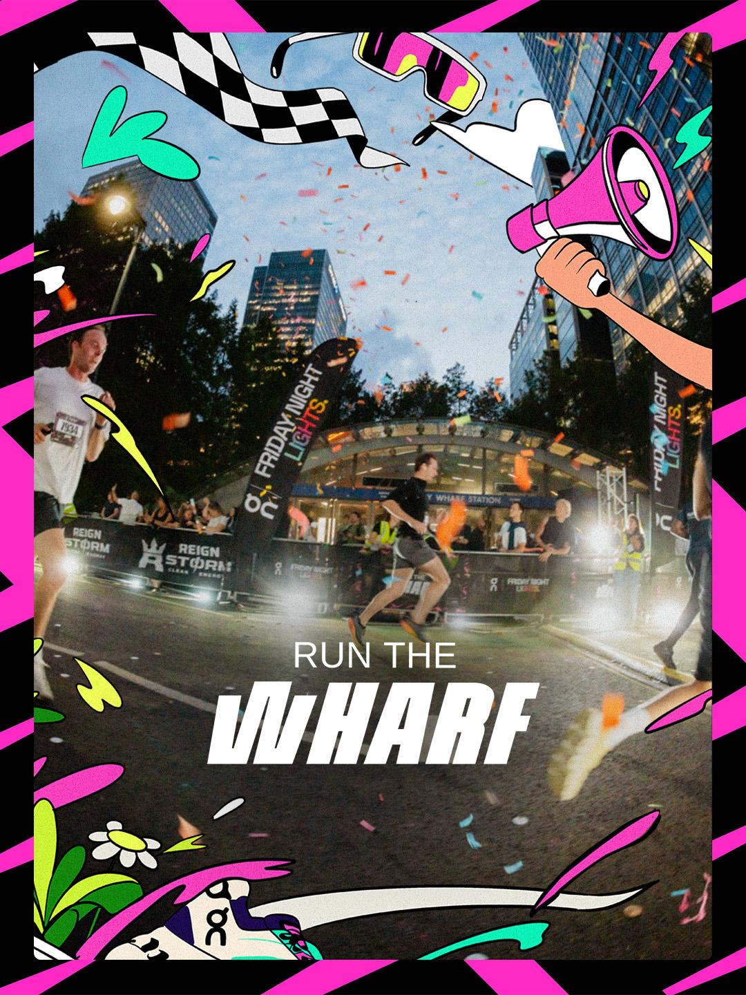
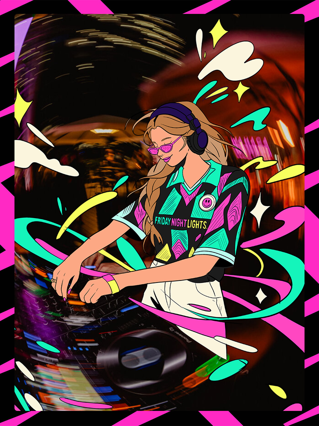
I have always loved illustration, not just as artwork but as a way of helping brands become more recognisable. Recently, I started sketching again and used Run The Wharf as a subject, exploring how drawn elements could respond to the energy of the event while still belonging to its wider identity.
What does illustration add to a brand?
A logo identifies a brand. Illustration can help give it a wider vocabulary.
That vocabulary might be expressive, editorial, playful, considered or highly functional. The important thing is that it comes from the brand rather than being chosen as decoration. A useful illustration style reflects something about the organisation, audience, subject or experience it is trying to create.
Illustration can help a brand to:
- communicate an idea quickly or make a complex or unfamiliar subject easier to understand
- create a recognisable look across repeated content
- add warmth and personality where stock imagery would feel generic
- build a visual world that can grow over time
This is particularly valuable for businesses and campaigns that need to produce varied content without losing recognition.
Illustration should begin with the subject
The most convincing illustrations usually start with observation. Before deciding on a style, look at what makes the subject interesting: its people, setting, movement, history, materials, language or small details.
That was the starting point for the Run The Wharf experiments. The event has a clear sense of place and energy. It moves through Canary Wharf at night, with runners, architecture, lights, crowds and a strong relationship between sport and culture. Those ingredients provide more useful creative direction than simply asking for an illustration that feels energetic.
When the subject informs the work, the result feels specific. It has a reason to look the way it does.
From a single drawing to a visual system
A successful illustration is not necessarily a single hero image. For a brand, the bigger opportunity is often to develop a repeatable system.
That might include:
- a line, shape or texture that can recur across assets
- a consistent approach to scale, colour and composition
- a set of characters, objects or motifs
- rules for how illustrations interact with photography, type and the logo
- different levels of detail for different formats
The system should be flexible enough to create variety, but consistent enough that people can recognise the source. A social post, presentation slide, poster or printed item should not need to look identical. It should feel related.
Where can brand illustration be used?
Illustration is most useful when it is designed around the real places a brand needs to appear. Depending on the project, that could include:
- social content and campaign variations
- websites and digital interfaces
- packaging and labels
- presentations and reports
- posters, signage and printed materials
- event maps, merchandise and participant communications
Run The Wharf is a good example of an identity that needs to move. Its visual language has to work in promotional content, paid advertising, participant materials and the physical race-day environment. Illustration can add a layer of character to those applications without asking every format to carry the same composition.
The difference between expressive and decorative illustration
Decorative illustration is not automatically a problem. Sometimes a project simply needs a moment of charm or visual relief. The distinction is whether the illustration is helping the communication or merely occupying space.
Before adding illustration, ask:
- What should this help the audience understand or feel?
- What does it express about the brand or subject?
- Can the idea work at the size and speed of the intended format?
- Will the approach still be recognisable when the content changes?
- Does it work alongside the rest of the identity?
These questions keep illustration connected to the job it needs to do.
How illustration fits within a wider identity
Illustration should not have to carry the whole brand by itself. It works best as part of a wider identity system that includes type, colour, layout, imagery, motion and tone of voice.
For more on how those elements work together, see what makes a brand identity work in the real world. For an example of a flexible identity applied across an event, explore the Run The Wharf project.
The role of illustration is to strengthen the system, not compete with it. Sometimes that means giving the brand a more human expression. Sometimes it means explaining something clearly. Sometimes it creates a visual signature that would be difficult to achieve through photography or typography alone.
Start with a visual question
The best illustration projects rarely begin with “Can you make this look more interesting?” They begin with a more useful question: what does this brand need to express that its current visual language cannot yet say?
That question leads to better decisions about style, subject, format and production. It also makes the work more useful after the first post or campaign has gone live.
If your brand needs a more distinctive visual language, our brand and visual identity service can help you develop the idea from the first creative direction through to practical applications across digital and physical touchpoints.