A strong brand identity makes decisions easier. It gives a business a recognisable character, but it also gives the people behind that business a practical set of tools. When it works well, teams spend less time debating how something should look and more time deciding what it needs to say.
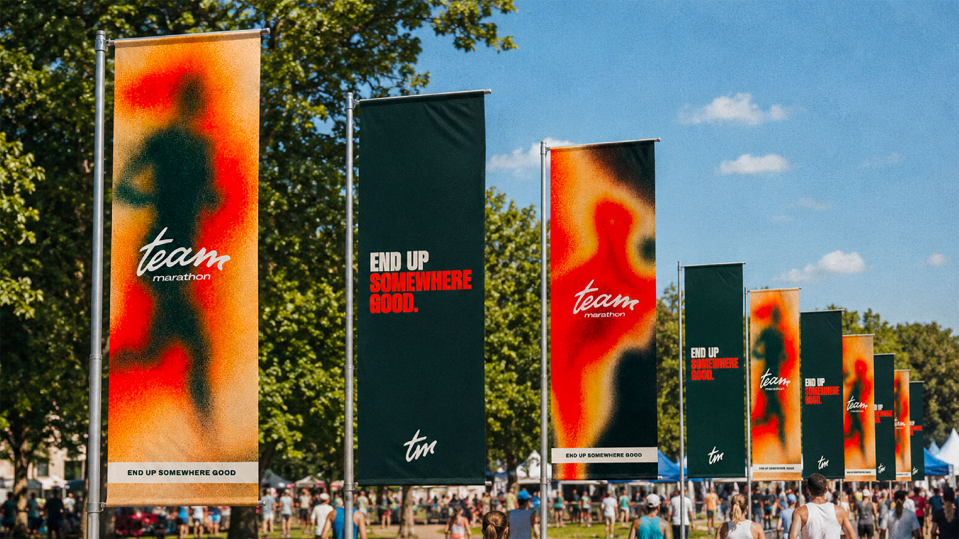
That distinction matters. A beautiful logo can create a great first impression, but a brand has to survive well beyond the launch presentation. It needs to work on a small mobile screen, in a presentation assembled at speed, across a busy event space and on the everyday documents customers actually receive.
Start with the job the brand needs to do
Before choosing colours or typefaces, it helps to define what needs to change. The identity might need to make a growing company feel more established, bring several services under one clear offer, reach a different audience or create consistency across a team.
These are business questions before they are design questions. They give the creative work a clear purpose and provide a useful test for every decision that follows.
The best identities are distinctive enough to be remembered and simple enough to be used.
Create something people can actually use
A useful identity has rules that create consistency without making everything identical. That usually means a focused combination of typography, colour, composition, imagery and tone of voice, designed to work together across different formats.
The guidance should answer practical questions. How does a headline behave? What makes a social post recognisably yours before the logo appears? How does photography sit alongside type? Which elements are fixed, and where is there room to adapt?
Good guidelines explain the thinking as well as the rules. When people understand why an element exists, they are far more likely to use it well.
What does a brand identity include?
A logo is one recognisable part of an identity, but it cannot carry the whole brand on its own. A practical identity usually brings together:
- A logo family and clear rules for how each version is used
- Typography that creates a recognisable hierarchy
- A colour system designed for digital and physical applications
- Photography, illustration or image-treatment principles
- Layout and composition rules that connect different formats
- Tone of voice and messaging guidance
- Motion or interaction principles where the brand appears digitally
- Templates and examples for the work teams produce most often
The exact mix depends on where the brand needs to work. Everleaf uses a nature-led visual language across labels, menus, exhibitions, presentations and digital content. Coole Swan carries its distinctive character through packaging, paid social, retail and print. In both cases, recognition comes from the relationship between the elements rather than the logo appearing more often.
Design for the everyday moments
The glamorous applications are rarely the ones that put a brand under the most pressure. Real value often appears in the repeated moments: proposals, email graphics, presentation templates, recruitment materials, signage and campaign updates.
Testing these applications early reveals whether the identity is genuinely flexible. If it only works when a designer has hours to finesse every layout, it is not yet doing enough for the business.
Make consistency achievable
Consistency does not come from a longer rulebook. It comes from giving people the right templates, examples and guardrails. A small set of well-made tools will often create a more coherent brand than a large library nobody knows how to navigate.
This is why implementation deserves as much attention as the initial concept. A careful rollout, focused first on the places customers see most often, helps teams understand the thinking and turns creative potential into meaningful change.
Leave room for the brand to grow
A brand identity should provide direction without becoming a constraint. Businesses evolve, channels change and new communications appear. The foundations need enough flexibility to absorb those changes while keeping the brand’s character intact.
The result is not simply a more polished appearance. It is a brand that communicates more clearly, supports the people using it and builds recognition through every interaction. For more on building that recognition over time, read why consistency matters more than constant reinvention.
If your identity looks good in a guidelines document but becomes difficult in daily use, it may need refining. Talk to us about making your brand work harder.